by Rachel Brown, Ph.D., NCSP
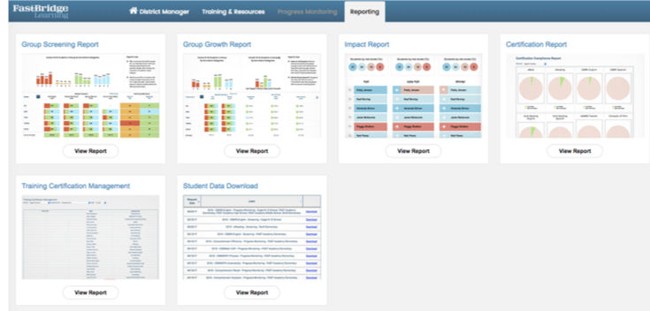
FastBridge Learning® offers many different reports that summarize student data. In addition to there being many different reports, there are also different levels of certain reports. For example, the Group Screening Report provides different information for district managers, school managers, and classroom users (teachers). The information available on each version of the report corresponds to the user type. For example, district managers can see data for all students in every building, school managers see data for the students in their schools, and classroom users see only the scores for students they teach.
This blog will provide information about the types of data shown in the two levels of manager accounts on the Group Screening Report.
District Manager
The District Manager view of the Group Screening Report is found in the Reporting section of the FastBridge website. To see this report, select View Report under the picture of a Group Screening Report and then select an assessment with data for your district and click on Go.

The report will appear on the screen. There are options at the top of the report, including demographic options, interval, and color coding.

Demographic options
Selecting this button will open a pop-up window with a number of student features. To narrow the data displayed in the report, select one or more of the options and then select Filter Students. Data for all students displays if you select Show All Students.

Note that demographic details for your students are only available if they are included in your student roster uploads.
Interval
The Interval option will show a list of all intervals for which data are available for your district. The list of available intervals will grow with each screening period.
Color coding
The Color Coding tool provides a way to see the data coded by either Benchmarks (pink and purple) or Norms (red, orange, green, blue). The default color coding is for norms. Above is a view with the norms color coding. Below is a view with the benchmark colors.

Infographic
The top section of the Group Screening Report shows a bar graph with the percentages of students whose scores fell in either the norms or benchmark group. Legends for both norms and benchmarks appear at the bottom of the report, depending on which colors are selected. In the above example, the percentages of students scoring at the high end, or in the advanced level, went down from fall to spring. This section of the report also includes information about the report’s intended use for organizing instruction at the Tier 1 (core) and Tier 2 (supplemental) levels. With this report, district managers can learn the percentage of students successful with Tier 1 core instruction. By using the demographic filters, they can see if subgroups of students have scores that are different from the overall group trends.
Building-level scores
In the next section of the report a district manager can see summary information for each school in the district. The horizontal bars show the percentages of students in each group for each school. The number displayed in the middle of each bar is the middle (median) percentile rank of all the scores in the school. The median rank is shown because it allows comparing scores across different grades in the same school.

In the above example, the median score for all students at the elementary school started at the 66th percentile, dropped to the 31st and then dropped again to the 30th in the spring. In other words, student performance started out stronger, but few students made gains over the school year. At the middle school, the median percentile across grades was 36 in the fall, rose to 46 in the winter and dropped to 34 in the spring. In this case, fall improvements were not maintained into the spring.
Grade-level scores
The above score summaries for each building likely generate questions about which grades or classes did better or worse, and the district manager can select each school’s name to open a new version of the report that displays summary data for each grade enrolled in the school. For example, here is the same report shown with a summary of data for all grades enrolled at Luceno Elementary School. The selected assessment for this report is CBMreading.

In this view, the median (middle) score (not percentile rank) is shown for each grade level. In the fall, the middle score of all the first graders who completed the CBMreading assessment was 41. From this view we can see that across all first graders, very limited score growth was seen, but greater growth was observed for fifth graders. In addition to the median scores by grade, there are percentile ranks for the median scores. The two available percentile rankings are for the district and nation. These ranks are different because the district column ranks the scores of all students of the same grade in the district while the national column includes ranks based on all students who completed this same assessment in the U.S.
Class-level scores
From the grade-level view, the district manager can drill down to see the scores for each class in a grade level. Below is a view of the scores for each third grade class.

The top of this view shows the percentages for the third grade, but the middle section shows the median scores for each class. There is a “More Data” option in this report, and by clicking this button, the district manager can see the class-specific distribution of percentages for each grouping. For example, in the fall 50% of April Paxton’s student had scores in the advanced range, but by spring this group included 19% of students.

Notice that a third percentile ranking column appears in the class-level view. In addition to the rankings for the district and nation, a column that shows the percentile ranking for each class now appears. The ranking always shows the interval selected at the top of the report. The above rankings were for the fall scores. Here are the spring score rankings. Notice that Melissa Kilgore’s class rankings went down in all columns but those for the other teachers went both up and down between columns.
Student-level scores
The final view that a district manager can see for this report is the individual student scores. These scores are found by clicking on a teacher’s name. Below is a partial list of Melissa Kilgore’s students sorted according to their spring scores.

This view shows the same information that the teacher can see, including each student’s score for the fall, winter, and spring screening periods.

In this view, the group (e.g., class) percentile rankings are not displayed because fewer than 70% of the students in the class had completed the assessment when this report was run. Local percentile rankings (e.g., group, school, district) only display when 70% or more of the students in that group have completed the assessment so that the rankings will not be misinterpreted based on limited data.
An additional feature in this view is that the FastBridge benchmark indicators appear next to the scores. FastBridge benchmarks are criterion-referenced indicators of how likely a student is to reach an end-of-year learning goal. The default benchmark settings are as follows:
![]() Advanced: scores at or above the 85th national percentiles
Advanced: scores at or above the 85th national percentiles
Low risk: scores from the 40th to the 85th national percentiles
![]() Some risk: scores from the 15th to the 40th national percentiles
Some risk: scores from the 15th to the 40th national percentiles
![]() High risk: scores at or below the 15th national percentile
High risk: scores at or below the 15th national percentile
The benchmark indicators are designed to give an easy visual cue about each student’s risk for not meeting the end of year goal. For students at low risk, no symbol appears. The student level view allows district managers to examine individual scores over time as well as see the same information that teachers see. More information about the teacher view of the Group Screening Report will be provided in an upcoming blog.
School Managers
Those FastBridge users assigned as school managers can see many of the same reports as district managers, but only in relation to the school assigned to them. For example, if assigned as a school manager, the principal of Luceno Elementary school would be able to see all of the above report levels for that school. The district and school manager reporting tools are designed to help school leaders understand student data from multiple perspectives. At the school manager level, a principal can view and discuss grade level scores with the building leadership team as well as the teachers in each grade. These data also provide information that can be useful in allocating resources across grades and classrooms. For example, in the above grade level report view, as a group, the first graders ended the year with many students not having made strong progress. This means that the next year’s second grade teachers will need to work hard to assist those students in making catch up growth. One approach might be to assign an additional teaching assistant to work with second grade teachers in providing Tier 2 supplemental interventions.
The FastBridge district and school leader reports provide information about how well instruction is meeting the needs of all students and whether different resources are needed across buildings and grades. Leaders can use these reports to assist with planning how to support teachers as they implement instruction throughout the school year.


